The selected works of Tim Gonzales

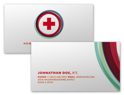
Identity system redesign for a home health company
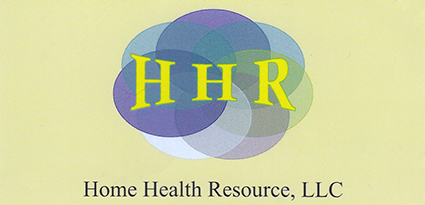
Home Health Resource's original logo was, admitted by the client, designed in Microsoft Word. I took it upon myself to help remedy their situation and come up with an updated design.
The concept of seven circles, one for each of the business owners, from the initial logo was something they wanted to keep. I updated the concept execution to have seven multi-colored rings circling the universal medical symbol.